
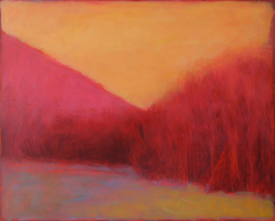
Yellow Sky at Dawn, 2006, Oil on Panel, 16x20
Thank you all so much for your wonderful words of encouragement, understanding and reassurance in response to my exceedingly depressing post on Friday. Oh, and the dose of reality from Chris was good too. Heh. Not to mention the great new ideas for imagery from Lauren, Chris and Lisa. Nudes in front of barns. Nude Chris in front of barns. Definitely an avenue for me to pursue....
As I mentioned in the comments, Doug had read my post while I was out doing an errand. Despite the fact that he had been out of town for 3 days and he had a pile of work waiting for him, he dragged me up to Utica to look at some art, in real life. Such a good guy. The Munson-Williams-Proctor Arts Institute is a fine arts center which has a really impressive collection of fine art, an arts education program and a performing arts division. We had heard much about their collection but had never taken the time to drive up there to see it. During the 40 minute drive we talked about my little breakdown and Doug asked me specific questions about what was going on when I get to the point of being blocked. I had to think about it a bit and then explain it to him so that he could understand, which actually really helped me understand things much better myself. I have been feeling as if I use the same colors in nearly every painting that I do. Specifically green and yellow. Even though I use about a hundred different kinds of greens and yellows, they are still pretty much just green and yellow. To me those seem like such realistic colors, especially when used on the land and foliage areas, and I since I don't really go for realism, it's really been creating a conflict for me. It was good to realize that, but I am still not sure what I will do about it. However, Doug assured me that he didn't feel that green and yellow were at all dominant in my paintings, that they were more the "work horse" colors. So I will be readjusting my beliefs about color and its placement and perhaps that will help me move forward again.
Anyway, the Arts Institute has a great collection and we really enjoyed looking through it. I'd say their prize piece is Number 2, 1949 by Jackson Pollock. It is one the drip paintings, painted on a very long piece of deep red sailcloth. It was displayed so that the back of it was visible and looking at that was almost more interesting than the front. There was an accompanying video playing that described the piece and recent restoration efforts, because as many of you know, Pollock's work has deteriorated quite a bit over the years due to the materials he used. The video spent a lot of time discussing Pollock's reasons for choosing the dark red surface, including the possibility that he was influenced by his western upbringing or his appreciation for Native American art. I was kind of thinking that maybe it was just a cheap piece of canvas that he had come across, but maybe that's just me. Other artist's work on display were Edward Hopper (a kind of mediocre landscape-but it had that light) Maurice Prendergast, David Smith, Andy Warhol, Philip Guston.
We got home right before the bus. And then my real life as a chauffer/mother took my mind off things. As did Saturday's activities which included timing at a swim meet, much careful scheduling to get everyone else where they had to go, baking cookies, and going to a real grown-up party that evening. Something we rarely do and which was great fun!
Sunday, I spent most of the day catching up on office stuff. I did a little painting, but not much. I didn't want to push it. I did work a bit on the last piece the I did and I didn't make it worse. So I will call that successful, for now.
I am keeping my fingers crossed about today's time in the studio.
5 comments:
Tracy,
I adore your colors. From reading your post on Friday, I thought that you were ready for a new direction. My favorite, somewhat hackneyed, phrase is that 'in every breakdown, there is a breakthrough'. It appears that that is already happening to you.
Wow Tracy - when I think of your work I think blue, pink, purple. So I had to go look - and sure enough there are the yellows and greens - where did those come from?
Did you see Shan's recent post about color? (one or two posts ago). She had some similar thoughts about the colors she thought Van Gogh was using but the discovered it was a lot more green than she expected.
Color is a funky thing. Thanks for talking in more detail about what you've been feeling. You have a good guy there supporting you.
Thanks Birgit, for visiting and for the compliment regarding my color. Sometimes my breakthroughs happen during a breakdown, but usually they happen when I am working feverishly to meet a deadline. I much prefer the latter:-)
Lisa, I know, they are the work horses. Thanks for the input-it is nice to know that my work isn't thought of as green and yellow. Because that it NOT how I see it either.
I did see Shan's post and immediately thought of my predicament. For now I think I have decided to go with it and not think about it all so much. Clearly that is what gets me into trouble:-)
I agree with Lisa: Your color isn't green or yellow. It's magenta. I think magenta every time I think of your paintings.
But then I like magenta. My earliest airbrush work was all in one color, which was magenta. I'm a big fan. I don't use it much any more, but I still like it.
My guess would be the yellow is to balance out the purple, and the green the red.
Yep I had to go back and look for the yellows and greens too, and wow there they were! Amazing huh. I think you are just thinking too much, stop thinking and just paint as you always have.
Post a Comment