Showing posts with label color. Show all posts

Monday, April 20, 2009

My Palette


I have been meaning to talk about my palette for awhile and since things have been so slow around here lately, now seems like a good time.

When I first moved into my new studio, I had all my paint tubes set out on the top of my flat file cabinet, which is right behind me when I am at the easel. Doug suggested that I put them all in one of the flat file drawers but I pooh poohed him and informed him that having to open the drawer would be WAY TOO INCONVENIENT.

Around Christmas time I had a get together in my studio and wanted to have the top of the flat file clear so that I could put out some of the small paintings I had been working on. So I loaded up the top drawer with all my paints (they fit perfectly). When it was time to get back to work after the holidays, I just left them where they were. Turns out that it is pretty easy to just open the drawer when I need them! Of course it helps that I just leave the drawer open while I am working. This also give me the top surface of the cabinet to clutter up with stuff. heh.


Obviously I like to have a lot of paint on hand! I like to have a good variety of colors available although to be honest, I mostly just use about a dozen or so of them regularly. Each day though, I try to put out one or two colors that I don't normally use. The colors that I currently am obsessed with (these colors change periodically, I am very fickle) are Indigo Blue, Green Ural, Medium Cadmium Yellow, Azo Green, Gamblin Light Blue, Caeser Purple, Vasari Ship Rock, Gamblin Light Magenta, Gamblin Cadmium Red Deep, Cobalt Green Pale, Cinnabar Green Light, Old Holland Violet Grey. I don't stick to a certain brand of paint because while I do like some brands more than others (I am loving Vasari paints lately!), the colors are what's important to me and every color varies from from manufacturer to manufacturer. For example I use a yellow from Grumbacher in almost every painting. Not the best quality paint ever, but the color trumps that for me.

Anyway. In college, I got in the habit of using a disposable palette pad and still use that now. When my studio was downstairs it was necessary to put everything away at night (mostly because of the cats who spend their nights walking on every single surface of the house) so the disposable palette was convenient for that. Now that I have a studio with a door, I have been tending to leave my paints out for a few days. I may end up getting a more permanent surface to mix my paints on, but for the time being I am still using my old set up. The pad sits in a butcher's tray which helps to contain the flying paint and Liquin and I use a tin foil muffin cup to hold the day's Liquin. This is my whole set up; the palette, and another tray with a jar of Turpenoid Natural to rinse my brushes and a rag to wipe the brushes off. And other junk too, heh:
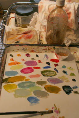
I put out the paint I think I will use each day, although I often add more colors, as I go, depending on what I feel like doing. I use very little paint and I don't do a lot of mixing of colors, maybe two colors, more if I want a mucky color. Mostly I thin out the paint with Liquin until I get the consistency that I want, and then mix another color in.
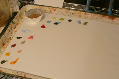
Unless I am painting more than one large painting in a painting session, I rarely have to move to a second sheet of palette paper. If there is paint left after I am done for the day, I leave it to use the next day. Or I will scrape it off with a palette knife and put it onto a new piece of palette paper if I need more space for mixing. This is my palette after doing about 10 very small paintings, 6x6 and 5x7's.
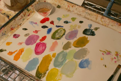
Traditionalists would probably flip seeing what I do with my palette. I use crazy colors, and different ones all the time, I just put them out in no particular order, and also different order each day. I have never felt the need to conform to the traditional palette and much prefer changing some things up, especially since some of the other parts of my process are fairly rigid. Makes a nice balance, I think.

So I would love to hear how you handle your palette. Traditional, crazy or somewhere in between?

Monday, November 3, 2008

Score!


Well in between last week's exciting weather, family stuff and my own laziness and lethargy, I have managed to finally get some work done on those figurative underpaintings that I did forever ago.

At every stage of these paintings I have stressed and worried and procrastinated. Mostly because I was afraid of the challenge. Not only about making a bad painting I think (I do crappy paintings all the time!) but because I feel really attached to this project of interpreting the people in these old photos I have been collecting. I want to do those people justice, yet express myself as well. Not to mention dealing with all the technical issues of painting different imagery on different supports with a different palette (sort of, I admit to using a similar palette as I do with the landscapes). Anyway, kind of a tall order and I think it is understandable that I went a bit off the deep end during this process.

I struggled a bit with the first one (above) that I added color to. Mostly with the color of the background and the texture of it (it has kind of a wallpaper-y pattern in it, not visible until one is right up close to it), first it was a lighter green, then I darkened it (it doesn't look quite so dark in person) and while it looks better, I am still not so sure about it. I might go back into it. It is also a tighter image, mostly due to the underpainting that I cleaned up maybe more than I should have, which kind of bugs me now. But I learned a lot with this one and there are parts of it that I am very happy about; her face, the sweater and her odd pose (the photo gets partial credit for that), so it was an important piece to get through. Also the beauty of working on paper is that I can crop the image if I want. And I just might do that, I like this crop quite a bit:


Then yesterday, at the end of the afternoon, I just walked right up to the easel and knocked out this painting:

As I mentioned in a previous post, I loved the underpainting and felt pretty sure that I would ruin it with color. Then it sat for a long time in my studio while I convinced myself that I was definitively going to mess it up. However, I am actually thrilled with how it turned out (it was so hard to photograph-must I add that it looks WAY better in real life?) and it is just what I had hoped to do with this imagery. I was particularly worried about the polka dots on the dress, because I left it very loose in the underpainting, knowing that it would give me trouble at the color stage. And it did when I tried to make it a multi colored pattern. After I scrubbed that off though and made it a solid red dress, the energy of the pattern is still quite visible:

Through the whole thing, I had to remind myself not to overwork and to let the underpainting do most of the work and it helped too that I had to stop and go have dinner with the kids. Stopped me from my own obsessive compulsive behavior. Heh.

Here are a few more close ups:


So I am back to being pretty enthusiastic about starting some more of these and have been spending the day choosing photos to use as reference and preparing more paper. I will start a whole new batch of underpaintings tomorrow.

PS. No official titles on these two yet, but they are 22x30, in case you were wondering about scale.

Friday, October 3, 2008

Painting the Walls (with a lot of buts)


So my old studio/new living room, as we call it around here is finally cleaned out, painted and ready for furniture. It took forever to find a place for the junkiest junk that I had stashed in there and in fact, more than a few things still are piled on the dining room table.

Initially, I had planned to paint the upper walls the same color that I painted the side walls in my studio, a deep neutral color called Peppercorn. I was so sure that this was the right color I added two extra gallons of paint in the order at the paint store.

BUT.

Then I made the final decision on the color of the furniture, and then I found a beautiful rug and of course neither worked very well with the Peppercorn.

So I drove down to Sherwin Williams and picked out a deep brown, because now I was sure that I wanted the walls to be a dark chocolate brown. Normally I am great at picking out wall colors, when I painted the whole rest of the house, every color was right on. So I was pretty confident that the first brown I picked was the right brown.

BUT.

After I rolled it on the walls (twice, just to be sure), I noticed that it looked a bit purple at certain times of the day. I liked how dark it was but the purple/raisin/deep burgundy thing each afternoon really bugged me. So it was back to my collection of paint samples where I picked out a nice warm brown, a bit lighter than I had planned however there would be no mistaking it for burgundy or purple or anything like that.

BUT.

I was a bit concerned after I rolled it on and then even more so after it dried and it still looked disturbingly like the dog's diarrhea. At this point I had bought 6 gallons of paint and even the kids were starting to make fun of me. So I decided that a good option would be to mix the diarrhea and the deep purple color together. Doug scoffed at me, but I reminded him that I certainly know a bit about color for crying out loud! What does he think I do all day, anyway? So I mixed the two colors together until I got what I wanted. Painted the room yet again and it was so close that I even went around and even painted the edges.

BUT.

After a few days of trying to convince myself that it was right I gave it up. It was a good mix but just not quite right for the room or for the sofa, chair and rug that I ordered. Doug was out of town for a few days that week and I took that opportunity to very quietly slink back to the paint store and buy two more gallons of the darker shade of the diarrhea paint, the one we had once discussed but passed on because we thought it was too dark. I rolled paint on the walls of my old studio/new living room for the fifth time, not counting the two coats that I had done five years ago when we moved in. I did a second coat just to be sure (again) and finished up all the edges. Again. This time though:

PERFECT.

I love it. It is a beautiful warm, dark brown, somewhere between milk and dark chocolate and the rug goes perfectly with it. I have some worries about the furniture, as the fabric swatch and rug combo bothers me a bit, but there is no turning back on that one so for now I am just enjoying the wall color.

And I am also appreciating the fact that the walls in this room are only half walls because of the paneling and so one can roll all the walls in just over an hour. My wasted time seems pretty minimal when you look at it that way, don't you think? Coulda been way worse.


Oh and we had planned to replace the hollow core Home Depot style front door this fall, but that project is on hold and so I think that I will soon be painting that door to match the rest of the trim. The hunter green is just not working for me here. And by the way, anybody recognize the top painting in between the two doorways?

Wednesday, July 2, 2008

Studio Lights

Communications, 2008, Oil on Panel, 18x24

So the lighting in my new studio is about a million times better than any studio space or room that I have ever worked in. In fact I don't recall ever having worked in a room with much if any good natural light (certainly no north light) and so over the years I have gotten quite used to working in a pool of light. And at this point I prefer it. Using lamps creates a stable light, one that I can depend on at any time of the day or night.

But now I have north light! Since I am not sure what to expect with that though, I decided to just go ahead and do my usual set up. I have three lights clamped to my easel. One is just a 60w bulb in one of those crappy metal lamp fixtures from the hardware store (I have a bunch of those, they come in handy). The middle one is a clamp on desk light, also 60w. The halogen light is my favorite. It's easily adjustable and I like the intense and warm color of the light from it, although having another bulb to even it out is important. I used to have a stronger halogen light but the switch broke on it and when I went to buy another one, I found that all of the halogen light were of a lower wattage. The new one is 100w and I think my old one was at least 150w. With the higher wattage halogen, I only needed one other lamp, but after I got the new one I had to had a third light to compensate.


I have another clamp light on my other easel, which is the one I used for larger panels in my old studio. Now that I have so much more room around my easels though, I don't know if I will do much painting at the second easel. But if I do, I have a bunch of extra clamp on lights and a good light stand.


The fixtures in the attic itself are fairly minimal. We put up two track lights, each with four lights. At first we put in halogen bulbs but I found the spotlight effect to be irritating. So I stood up on a too short step ladder the other day and put in 60w bulbs, which do a much better job of providing overall light in the room.


The south end of the attic is quite a bit darker than the north end. Mostly because of the historically accurate, yet small and impractical oval window that has a louvered exterior. Luckily though, I have a handy dandy floor lamp (you can see it in the photo above) that I picked up at a yard sale for five bucks a few years ago. It can take a 300w bulb which really lit up my old studio downstairs and now it is great for the dark side of my new studio. I won't need that lamp on when I work at my easels, but it will be good for when I have to prep panels on the south end of the room.

I know that I really should be using energy efficient bulbs, but I gotta say that I really hate the color of their light! We put one into a few of our can lights in the kitchen and their cool light on my nice cozy warm yellow walls bothered me so much that I finally changed them. So I will use the incandescent bulbs for as long as possible and I may even stockpile a few thousand. I keep hearing that they may soon be extinct and that we will have to use the fluorescent energy savers.

Anyhoo.

No great words of lighting advice here, I am afraid. I like my lighting, but would never recommend this wacky set up to anyone. I suppose I will change things up at some point and it won't be the end of the world. For now though, I do not plan on messing up what has worked for me so far.

More about moving into the attic tomorrow. It is filling up!

Tuesday, March 18, 2008

A Reminder of How Subjective Art Is

As I mentioned in a previous post, the feedback on my work varied wildly at the residency in Vermont. Not only from the other residents, but also from the visiting artists. Studio visits by the visiting artists were optional, however I signed up to meet with all of them. Because I was working on developing new imagery I knew that getting so much feedback could be problematic. And it was. The first two visits really threw me off and after each meeting, it took awhile for me to get back to work, I was so confused and unsure of which direction to take. By the time the second two visiting artists came in, I had narrowed my focus a bit with the figures and their criticism didn't really affect me quite so much. Mostly because they both had completely different opinions about each of the pieces that I showed them. It was a wash.

Anyway, I thought I'd put up a few of the pieces that no one agreed on and describe what was said about them.

This piece: by far got the most comments, mostly positive actually. Which was frustrating, and then by the end of the month, comical to me because I was so disinterested in it that I couldn't bear to even try to continue working on it. However, two of the artists had completely different ideas about what direction to take it, despite the fact that I HAD NO INTEREST IN IT. Visiting Artist #1 said I should develop the background, and leave the face blank. #2 liked it too and said I should leave it, #3 said it was the most successful painting that I had done and went on to say that it was a clear statement on isolation in America. Ok. #4 didn't really have much to say about it, although she liked the way I painted the dress.

Most of the residents that saw it, liked it. Some thought I should finish it, some said no way and most said they liked the blank face.

#3 spent a lot of time telling me why this piece worked so well: which was actually very interesting and helpful. #4 liked it (and my landscapes in general) and #1 and #2 didn't really acknowledge any of my landscapes, except in passing. #2 did say that the landscapes in general were too polished and it bothered him that he could not see any "struggle" in them.

I had been doing some still life paintings just to keep working, while I was trying to figure out the figures and so each of the visiting artists saw them in varying stages.


(These last two are the ones on canvas that I worked on while stapled to the wall. The canvas, that is, not me:))

#1 and #2 completely dismissed them and one implied that still lifes probably wouldn't further one's career as far as reviews, museum shows, etc, but one could sell them and maybe meet expenses. #3 didn't really talk about them either, although she mentioned that if I were interested in portraying still life objects, I could work them into the figurative paintings. #4 liked the tulips but again, didn't really have anything specific to say about them. I can understand the response here to these, they were really just busy work, valuable for that.

The figurative work that I did in the drawing sessions also got very little discussion, with the exception of #3. Who felt I needed to work from the figure much more. She thought my lines were too hesitant and that I erased too much. She though I needed to develop the model's surroundings in the oil sketches more. I didn't agree much at all with her assessment of them, but didn't say anything, or explain that the erasing is part of the drawing. Maybe it isn't working if she sees it as erasing rather than part of the drawing? She is the only one who has ever said that to me so I don't know how seriously to take it.

I had just begun the small little paintings of the single figures:when #2 visited, and I can't recall if #1 saw them. #2 liked them, he mostly saw them in the drawing and underpainting stage and liked how they were so subtle, appearing and disappearing. #3 didn't like the color on them, but liked the underpainting stage, and in fact thought one of them was very successful: and I should leave it be. (after much debate with myself, I went on to paint color on it anyway) #4 felt the the whole direction was not very good. She said they would never be more than "vignettes," which sounded like a bad thing, the way she said it.

A few more observations. #1 and #2 did not even mention my use of color. #2 said "your process is killing you" meaning that he thought the way I paint was dragging me down and limiting my options. #3 asked me about my color and how I have come to it, but didn't really talk about it otherwise. #4 was the only one who discussed my color, and responded to it at all.

With #1 I spoke entirely too much about how I show and sell my landscapes. His visit was early on in the month and I was still a bit nervous in the whole environment. And when I am nervous I talk way too much, which is exactly what I did with him. I made an effort to keep my mouth shut as far as my exhibition activities go with the other artists. However, I definitely got the vibe from all of them that selling from a gallery was not a good idea and would badly affect the direction of one's work.

#3 didn't like this painting:She thought it was too sweet and sentimental, and that the tree should be more prominent. #4 loved it, thought it was strong and bold, but that it just needed a bit of form in the foreground in order to create more foreground. And I did more work on that area.

Now that a little time has passed, I have a different perspective on much of the feedback I received. The very specific comments concerning my process or what my intent was as far as respect vs sales, while perplexing at the time, have actually served to help me feel more confident about what I do. I LIKE my painting process and I enjoy it. I like that it is limiting and I like the challenge of having to work around those limits. I also know that when those thing really don't work for me anymore, I will change things up. And while I do make some decisions regarding exhibiting or gallery representation based on what I'd like to happen for me in the future, I don't think much about it when it comes to actually making art. If I were so concerned about showing in Chelsea, for example, I would NOT be painting a representational landscape or barns, god forbid. heh.

The visit from #1 and his comments helped me realize that I needed to simplify the figures, get rid of the backgrounds and work at a smaller scale in order to work out some of these issues. The encouragement from #2 and #3 concerning the small figure underpaintings was good, although I ultimately decided that I needed to add the color anyway. And I am glad I went in that direction. I can always do more that are monochromatic anyway. And #3 really gave me insight about why some of my pieces worked, as well as why some didn't. #4 encouraged my use of color, giving me some ideas about how to use the color to create and push the forms behind the figures. She was also really nice to just chat with and I appreciated that.

So overall, despite wanting to pull out all my hair and give up painting entirely after most of the critiques, there was some valuable information from each visit, that will ultimately help me. But the really amazing thing was how much the opinions varied.

Tuesday, September 11, 2007

Involuntarily Moving On

Setting Sun, 2007, Oil on Panel, 8x10

Note to self: Don't panic when you run out of your favorite color. It can be a really good thing.

I tend to work somewhat obsessively with colors. For example, nearly all the skies I have painted in recent months have been a combination of a blue and greenish yellow color. Before that I used Old Holland violet grey for all my skies and before that it was a cobalt blue mixed with a lighter blue. I usually use the same colors until I can't bear to look at them for a second longer, then I move on.

Sometimes however, running out of a tube of paint and neglecting to order a new one in a timely manner will force me to move on too. I recently ran out of Gamblin Radiant Blue and so yesterday, I reluctantly mixed a new version of blue green for my skies, with good results. And as often happens, which I tend to forget, I am feeling a bit energized by having to change things up.

This morning I ordered a few tubes of the Radiant Blue anyway, but I suspect that the mood has passed and by the time I get it, I won't be interested in using it. At least not in the sky.

So keep an eye out for some light blue barns. That blue is going to show up somewhere!

Tuesday, March 20, 2007

Best Friends Forever

BFF, 2007, Oil on Panel, 24x24

I have been wanting to put purple and red together for quite some time. While I use each of those two colors often, I have rarely put them right next to each other. It can be a tricky combination as I have found. Many previous paintings have been scrubbed back down to the underpainting because I couldn't get the right red and the right purple AND get them to harmonize rather than clash or cancel each other out.

The underpainting that I posted yesterday was a good candidate as it only has two structures. Last week I found out how difficult it can be to coordinate three different colored structures so I wanted to stay away from that particular challenge this time. I started with the red on the back building and then added the purple on the front structure. After I added that, I decided that the Perylene Red wasn't right and I went back to my trusty Cadmium Red Deep. I still wasn't sure about the colors together but I decided to add the surrounding colors and then reassess. So once I added my worker bee colors, usually blues, yellows and greens, I thought the purple and red were fine. But the roof on the front building, which was initially dark purple, bothered me and so I partially wiped it off. Once I did that the light purple side of the building really popped and gave the piece a different look. Not better necessarily, just different. So the roof probably could have gone either way, dark or light but I decided that I liked how the light roof affected everything else and I am calling it finished.

And because I am pleased with the results I will probably beat this combination into the ground for months and months. Heh.

PS. You'll have to take my word for it that the colors are working together. It's kind of a dark day and it was tough to get a really accurate photograph. I'll try to get a better one later.

Wednesday, March 14, 2007

The Suburban Edge

Suburban Edge, 2007, Oil on Panel, 18x24

I have been working very slowly on the four underpaintings of houses that I did about two weeks ago. Whenever I look at them, I feel enthusiastic but when I actually get in front of them with a brush in my hand and the paint all ready, I freeze up. Where to start?

Usually, in the barns and landscapes, I find that the busier the image is, the less it works for me, so I simplify. The house images have so many more elements than the barns or the landscapes and so I struggle a bit with what to do and where to go. I am not used to thinking about color so much! Usually I just pick a color and the rest flows from there.

And coordinating the colors has been the biggest challenge. In this piece I had initially painted the house on the left a beautiful purple and the house on the far right was the same red that it is now. But the middle one wouldn't cooperate with what I wanted it to be. I probably painted it five different colors, white, blue, green, yellow, pink. Nothing worked to bridge the red an purple. Finally I wiped all the paint off of that house and left it until the next day.

When I looked at it the next day, the the answer seemed obvious to me. Even though I LOVED the purple house, that color was the real problem. I painted over the purple and changed it to the yellowish orange you see now, which allowed the initial color that I had envisioned for the middle house to work. So I ended up painting it almost exactly the very first color that I had tried the previous day-white (actually Naples yellow) with blue shadow.

It still needs just a bit of refinement, but it is basically finished and I am quite pleased with it. And it was good to be reminded of how important surrendering a part is to make the whole piece, well, whole.

Now I am off to try again with getting a purple house into this series.